A cohesive launch package

Fine-tuning
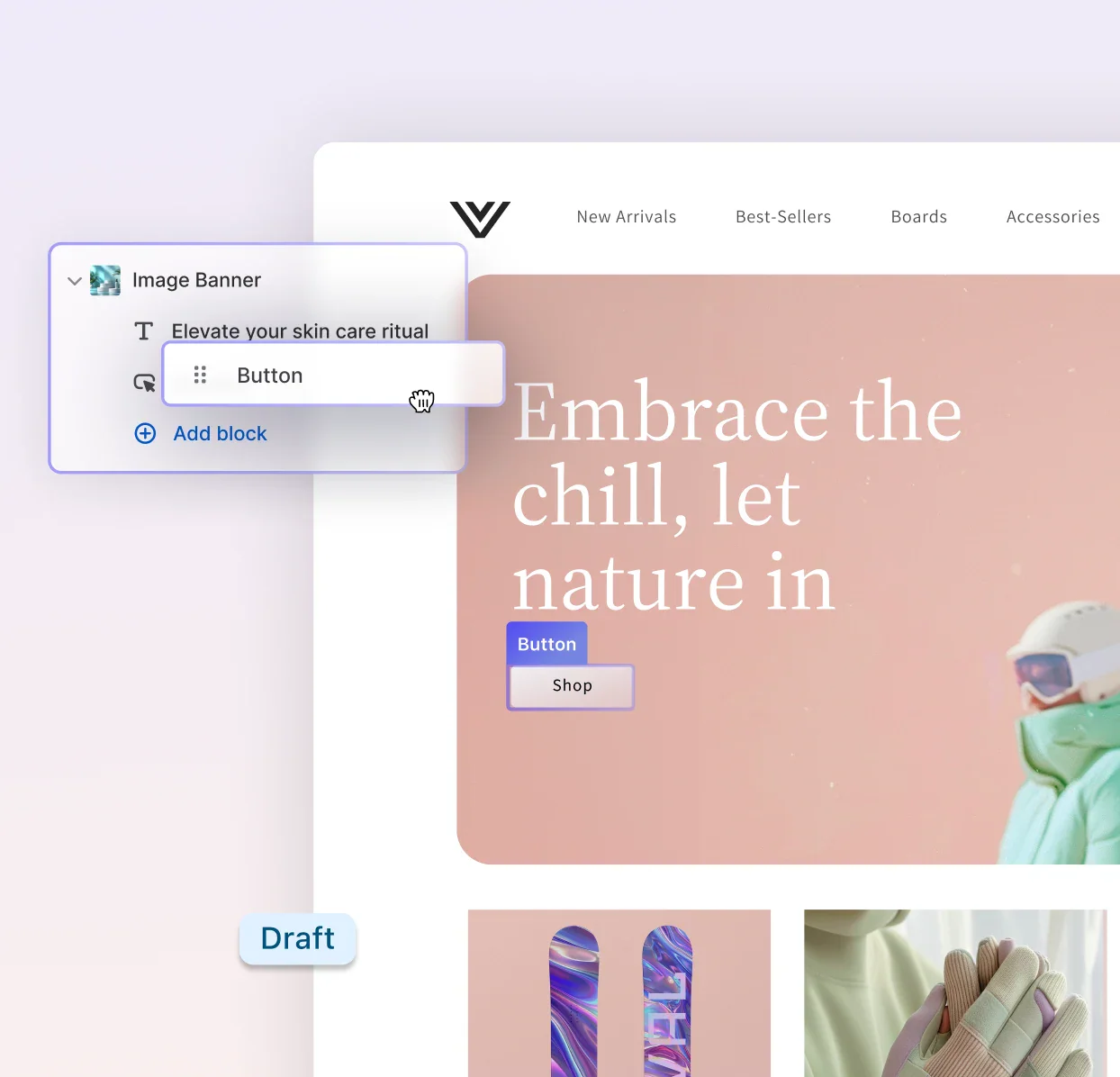
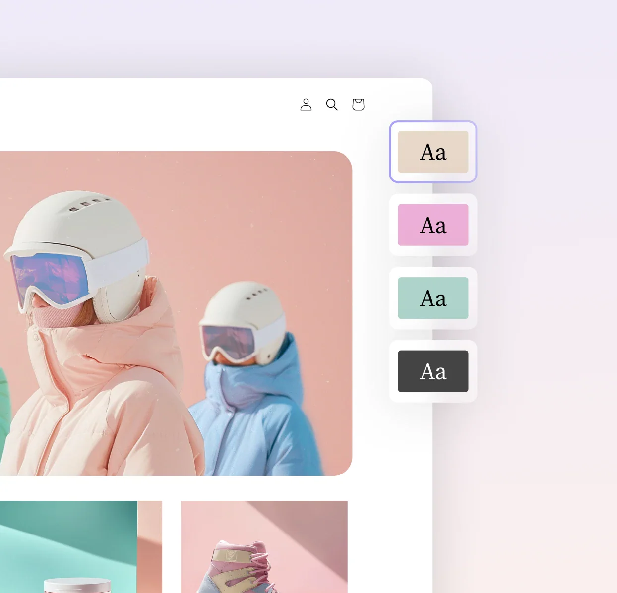
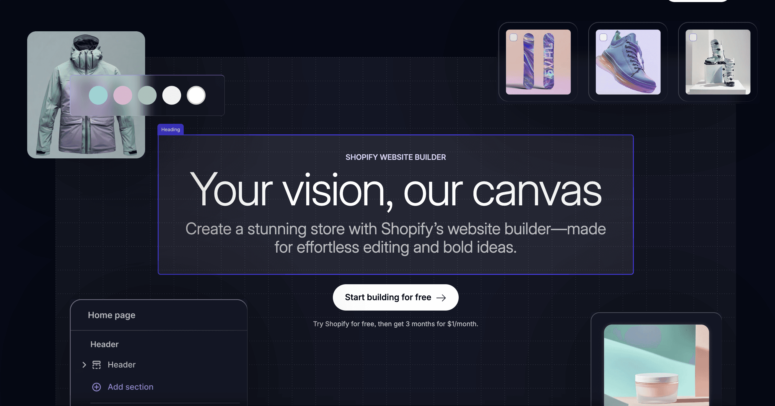
I partnered closely with the lead designer to support the page with visual direction and refinement. Rather than reworking layouts, my focus was on strengthening hierarchy, improving balance, and elevating the overall visual confidence — ensuring the experience felt intentional, cohesive, and unmistakably Shopify.
Small moves, big impact
Focused refinement on the hero, feature sections, and key UI moments. Typography tightened, contrast sharpened, spacing made more intentional. Nothing that disrupted what was working, everything aimed at making the message land with more conviction.
Driving confidence and clarity
The page shipped within scope and on time. What changed was harder to point to than a layout, the overall quality of attention. Sometimes the most useful thing a designer can do is make existing decisions feel fully committed to.